When Catherine House needed help to refresh its branding and website, we didn’t hesitate.
Established in 1988, this not-for-profit organisation is the only South Australian-based service supporting women experiencing, or at risk of, homelessness. Our challenge was to refresh the brand’s visual identity and to design, and develop, a new website that better reflects the organisation today.
Catherine House has a diverse audience, ranging from women in need to corporate partners and government, which added a layer of complexity to the rebrand and website build.

Our creative solution had to have broad appeal and a delicate balance needed to be found between maintaining the brand’s heritage, and existing equity, and moving it in a more contemporary direction.
The project began with a workshop involving the Catherine House team where the visual identity and website were reviewed to identify the brand’s strengths.
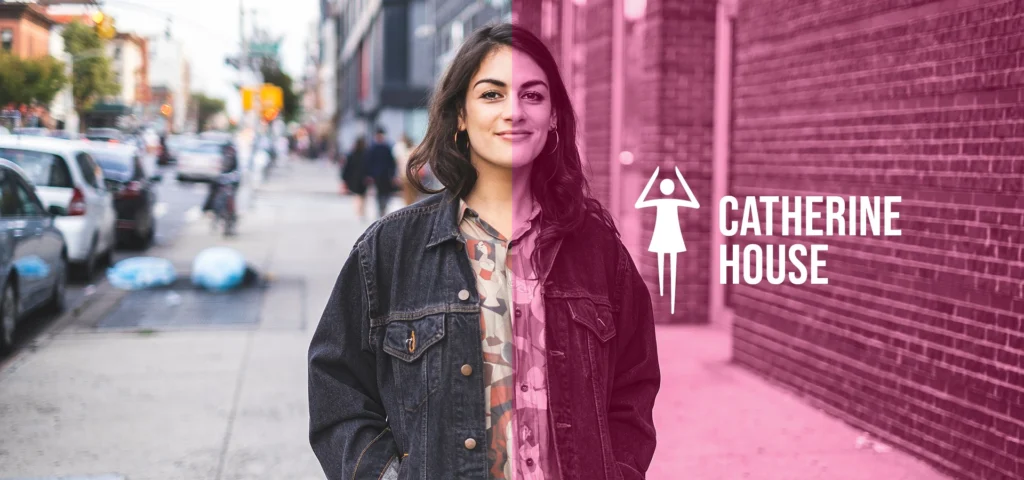
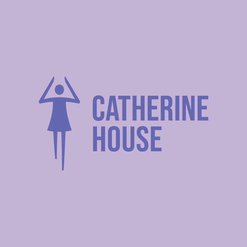
We evolved the organisation’s recognisable female icon into a simpler, more balanced version, and the brand font was updated, to convey inner strength, self-assurance, resilience and progress.
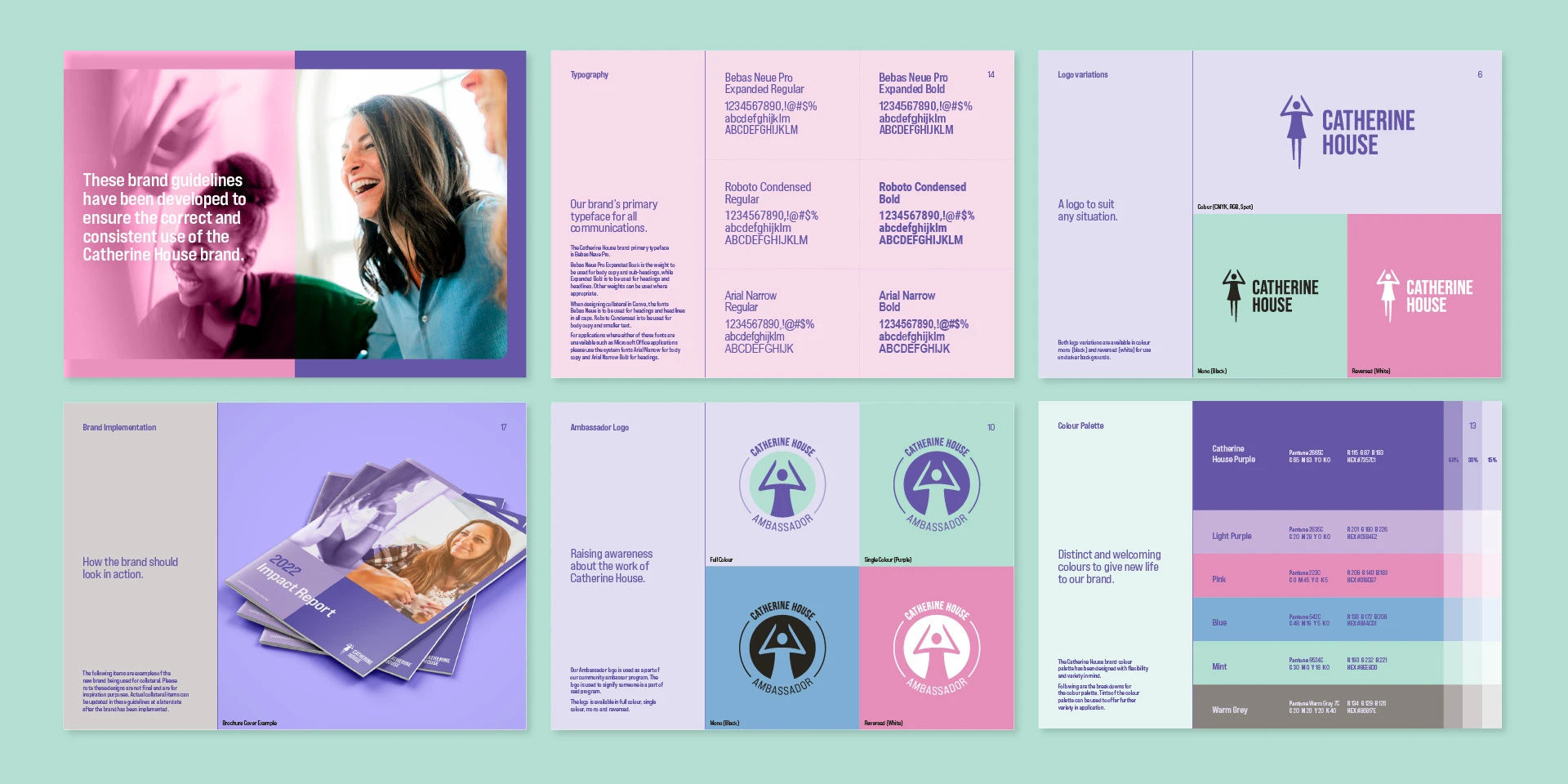
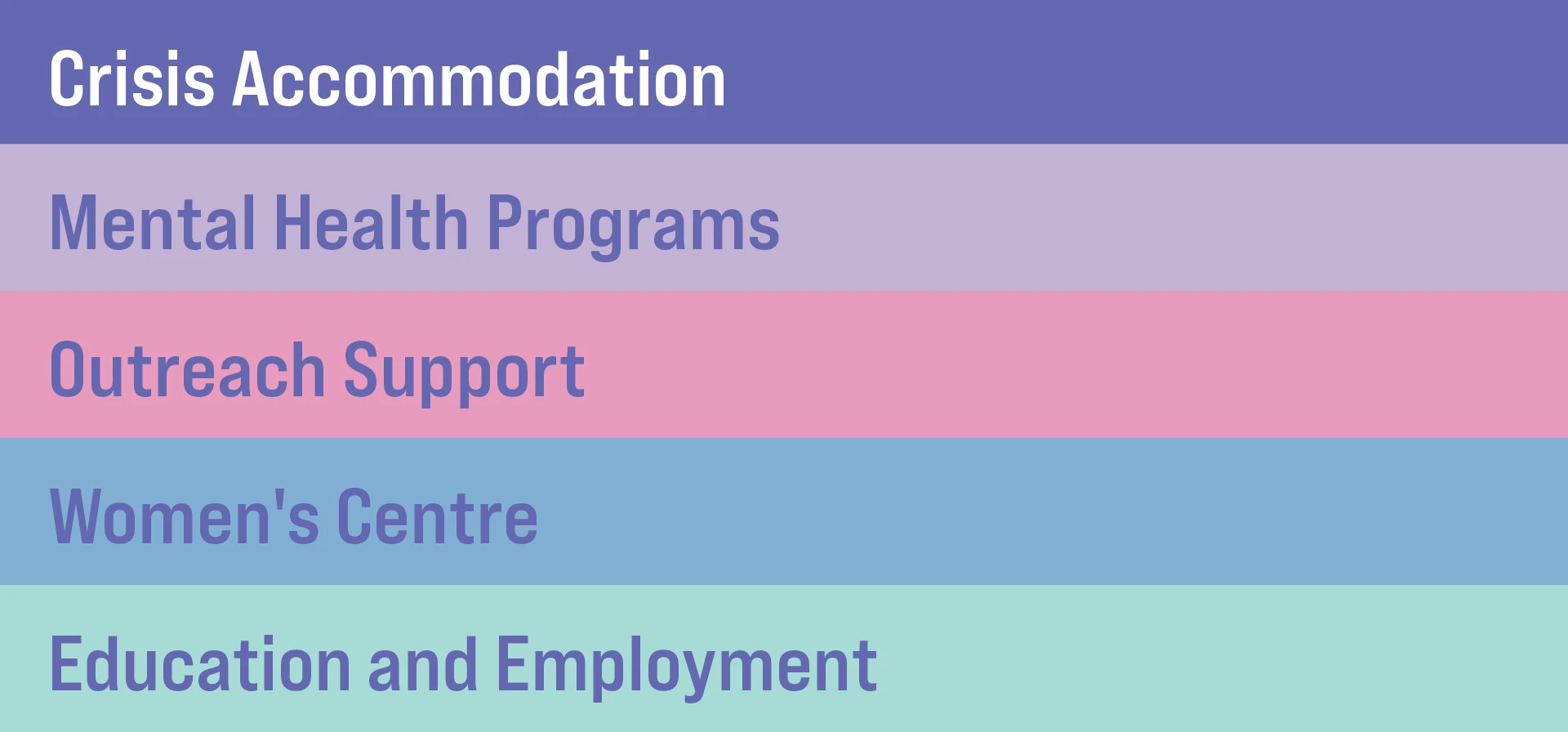
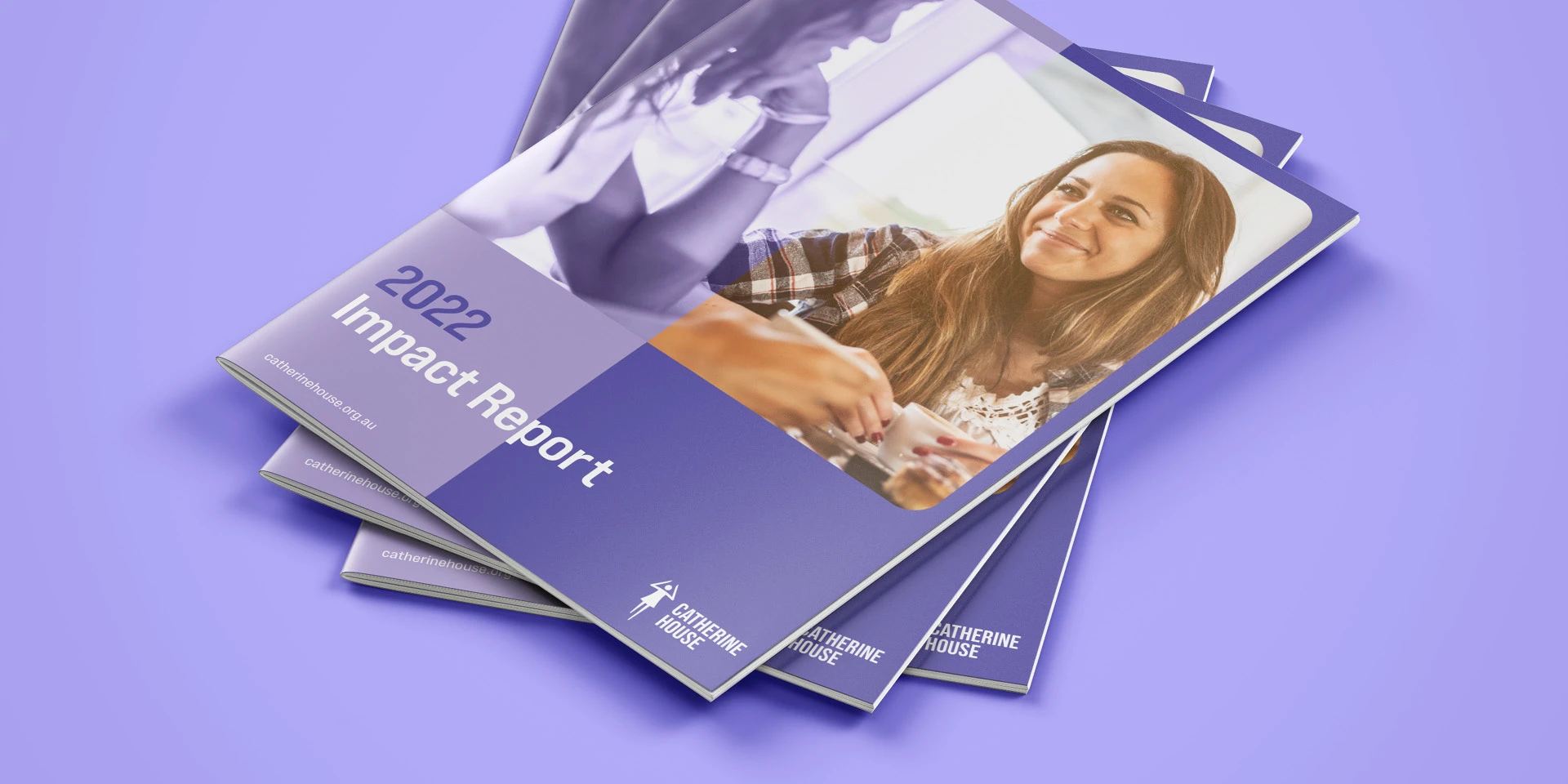
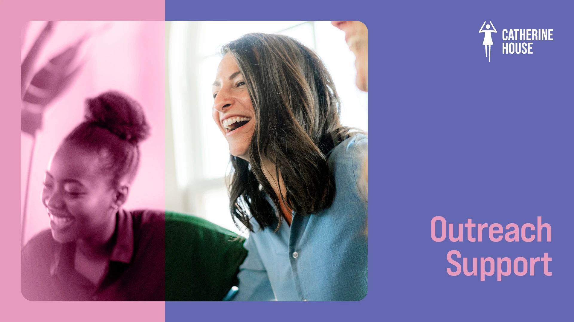
Purple was retained as the brand’s primary colour and a softer secondary palette was introduced to differentiate between the organisaton’s service offerings.
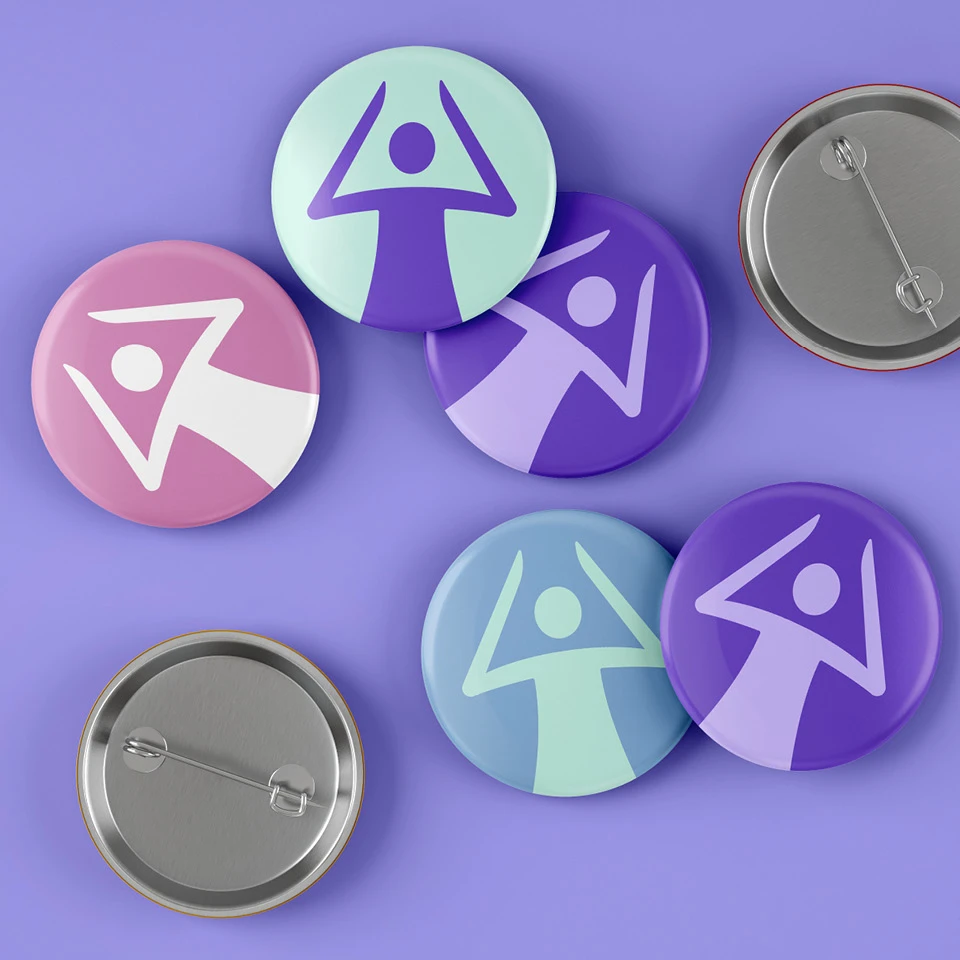
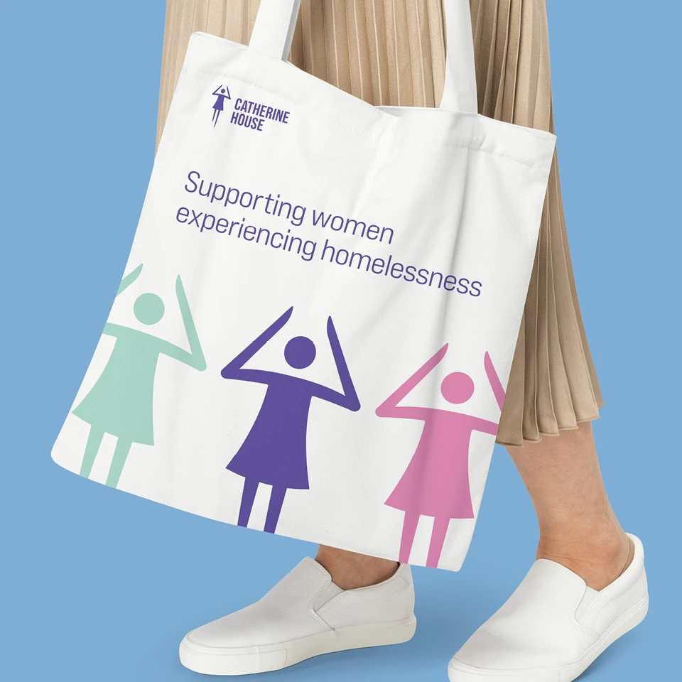
The new visual identity was implemented across its marketing assets including the new website.
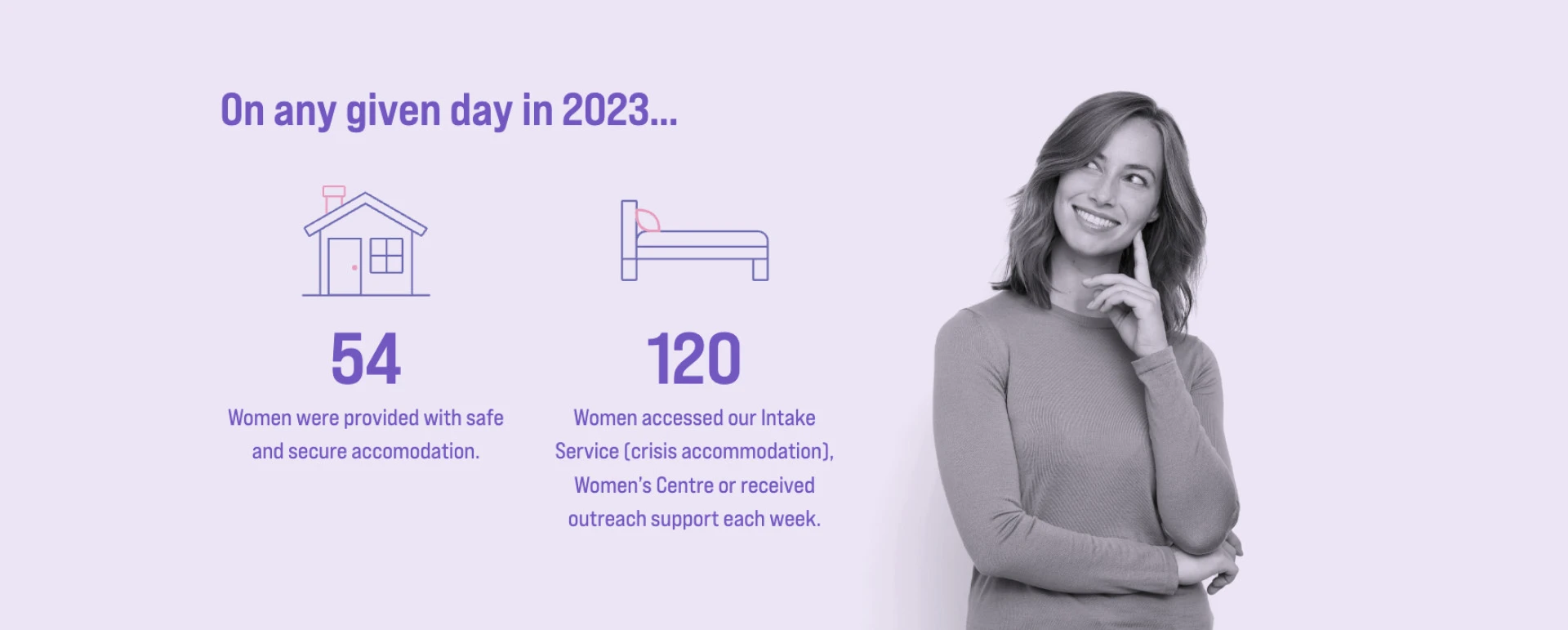
With user experience front and centre in our minds for the new website, we added more prominent calls to action as well as a new search feature, news section and frequently asked question (FAQ) page.
A full website audit was undertaken, and a basic search engine optimisation (SEO) strategy developed, to boost the site’s organic search engine ranking on Google.
The website is now more modern and inviting, and the site navigation and responsiveness improvements we made have seen e-newsletter sign-ups grow significantly.
